Designing a SAAS analytics product
Inopt helps businesses understand how their website visitors turn into customers. It simplifies complex analytics by focusing on the most important data, making it easy for businesses to see what’s working. This tool is especially helpful for small and medium-sized businesses (SMBs) and startups that need quick, straightforward insights to make smarter decisions and grow effectively. Inopt acts like a personal guide, turning visitor behavior into actionable information, saving companies time and resources.

Quick Navigation
📒 Context
🧐 Problems
🎯 Goals & Deliverables
👩💻 Process & Research
✍️ Rough Work
🧪 Usability Testing
🔬 Design Anatomy
✅ Final Design
📊 Results
📒 Context
Inopt is aimed at helping businesses understand how their visitors gradually build interest before taking action. It is an experience focused on making analytics simpler by focusing on things that matter. This was a new project with a defined target audience made up of SMBs and startups.
🧐 Problems
- How might we design an application that simplifies analytics in a form that can be consumed in one glance?
- What can we do to make the installation process less time consuming for users?
- What features we can incorporate to increase our user base?
- How might we reduce the learning curve in extracting information from the collected data by 50%?
🎯 Goals & Deliverables
The goal is to provide a different approach to analytics for new companies so that they can uncover insights about their online business by spending a fraction of what they will pay otherwise while reducing the learning curve in understanding the collected data.
Deliverables:
✓ User and market research
✓ Wireframe
✓ Prototype
✓ Design System
✓ Final visuals + Promotion design
✓ Ensuring WCAG 2.0 AA standard
👩💻 Process & Research
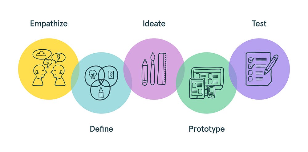
Research focus areas:
- What do first-time online businesses use for analytics?
- What kind of metrics do online businesses require for their products?
- What products do these online businesses use or are aware of?
- Where did they hear about other analytical products?
- What features do online businesses use the most in analytical software?
- How do the businesses use those metrics and conclude if something is good or bad?
- How do the businesses compare metrics they collect?
- How do businesses define a product as easy or difficult to learn?
The research started with me exploring the studies done on metrics that helps online businesses in different customer stages. Below are some insights into this research:
Metrics that are useful in different customer stages:
📌 Product discovery metrics like Impressions, Reach, Engagement.
📌 Consideration metrics like Cost per acquisition, Organic acquisition traffic.
📌 Conversion metrics like Cart abandonment rate, Checkout abandonment, Micro to macro conversion rates, sales conversion rates.
📌 Retention metrics like Customer Retention rate, Repeat customer rate, Ecommerce churn rate.
_
Understanding the user & finding patterns:
To dive deep into empathetic research, I reached out to five people from 25 years old to 65 years old running an online business.
Things I covered in these interviews:
- How do they measure their business performance online?
- What are the things they wish they know about their users or buyers?
- Had it made an impact on their business?
- Their experience of selling or providing service online so far?
- How much do they spend on analytics?
- What features do they use daily?
- How much do they spend on marketing?
- What do they feel about the current solution they are using?
- How do they conclude from the data they collected using analytics?
- What products are they currently using for analytics?
- How do they acquire users?

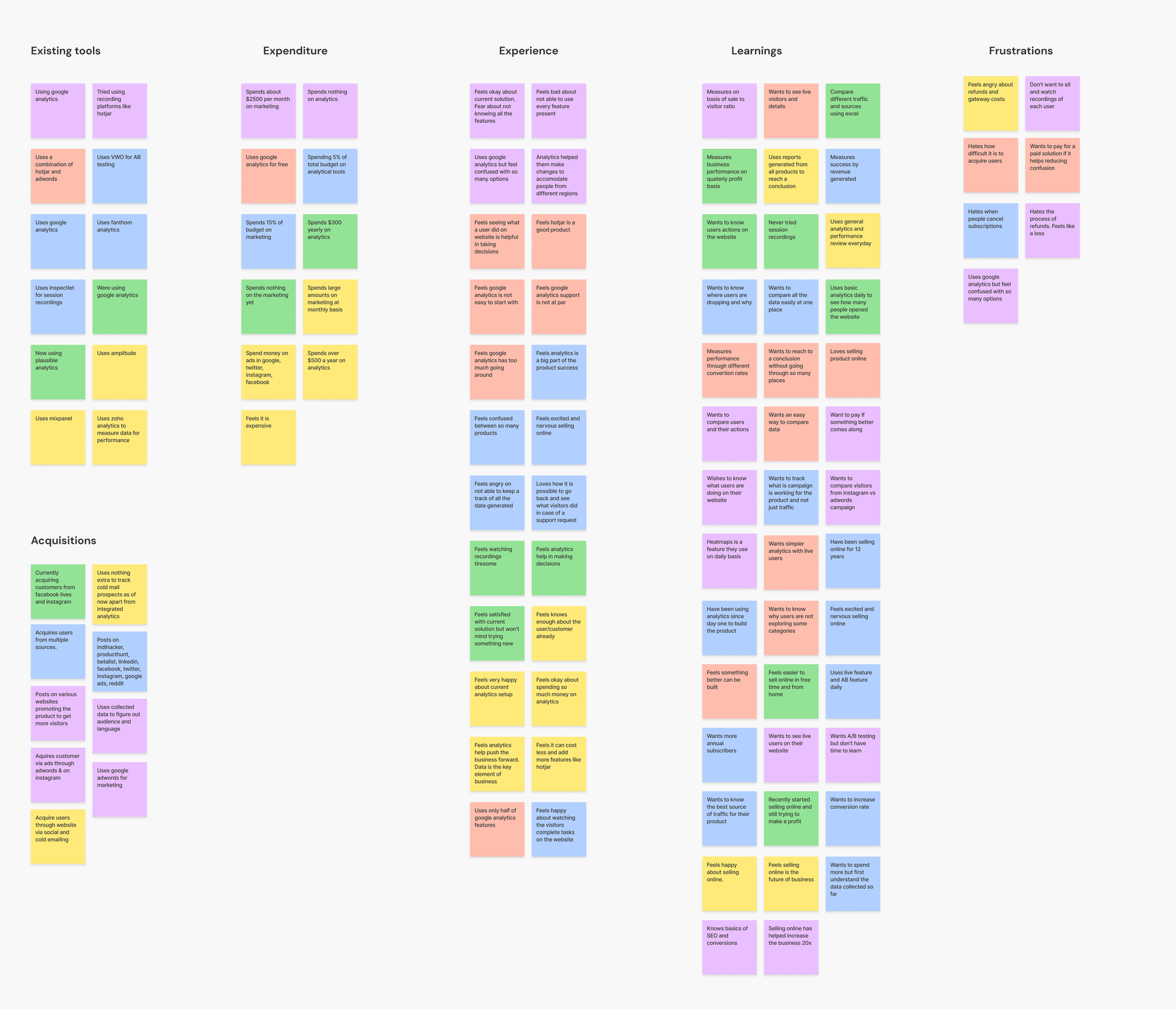
Insights from user interviews:
📌 Users want to know what actions visitors did on their website/web application.
📌 Users want to see visitors live on their website.
📌 Users feel confused about AB testing.
📌 Users find it difficult to understand data in Google Analytics
📌 Users love the screen recording feature available in the market.
📌 Users like to watch actions taken using heatmaps.
_
Target Audience
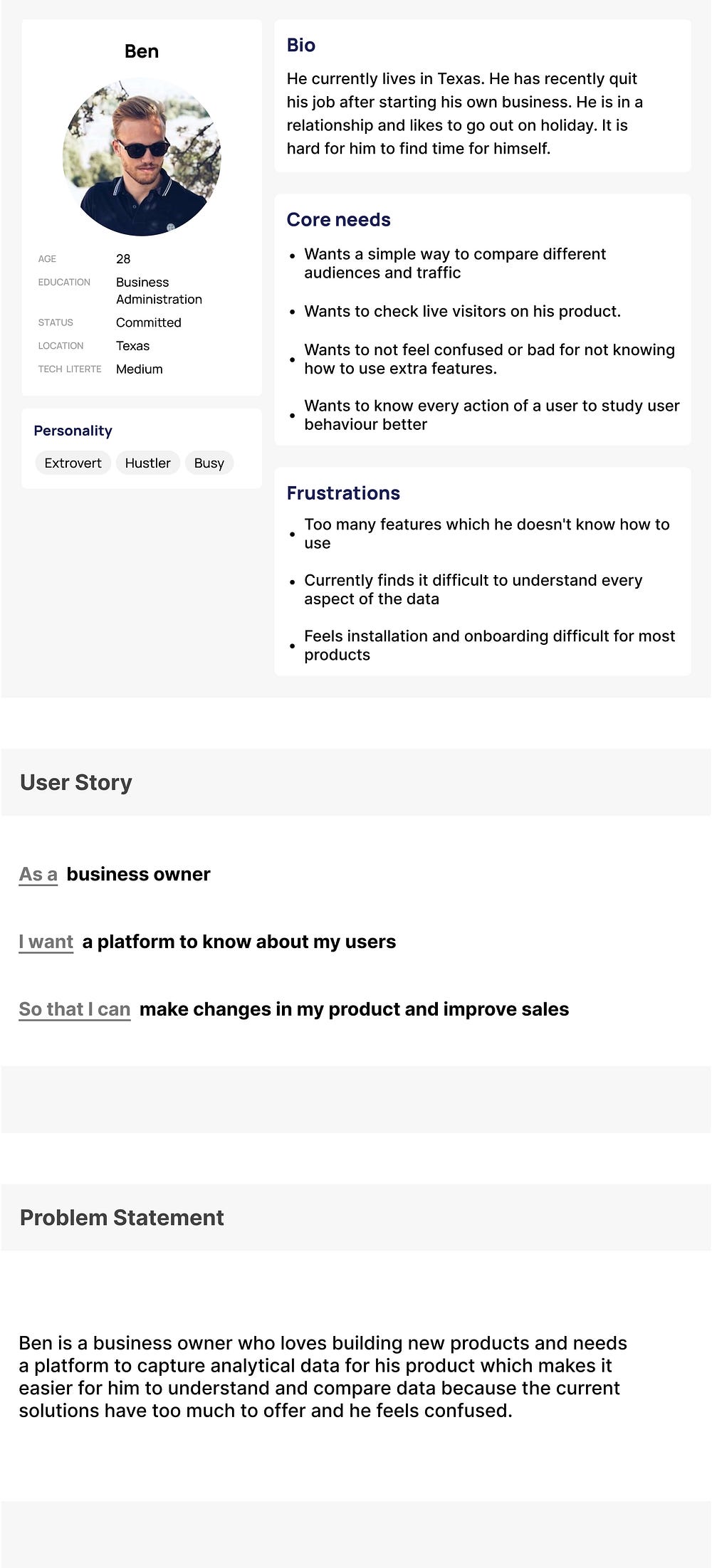
Based on user interviews, I went ahead and created a persona for our project which I will use to build our solution:
_
Competitive Analysis
I sorted five direct & indirect competitors with a large audience to learn from and performed a competitive audit to discover their strengths and weaknesses which we can gain from in our design process.
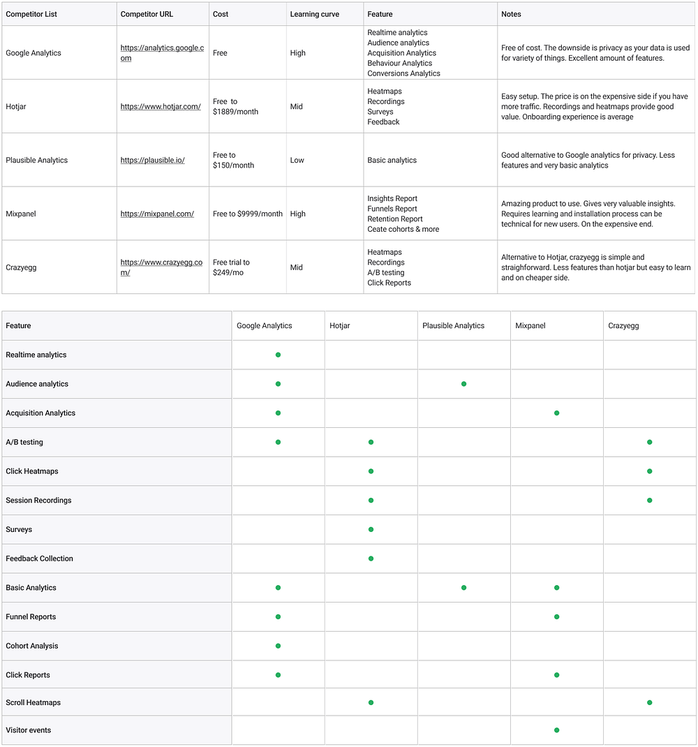
Insights from the competitive analysis:
📌 The learning curve between products on average is high. Products with a low learning curve offer the very basic analytics
📌 Google analytics offers free service in exchange for the data.
📌 A combination of simple installation and quick onboarding can do wonders for a product.
📌 Some products show too many numbers on a screen which makes the product look confusing even though it is full of valuable insights.
📌 Integration options are available in plenty and is something users love.
📌 A/B testing is offered by fewer products with a high learning curve.
_
Hypothesis statement
I believe that if we offer a visual way of comparing the collected data then it will help our users understand the results better and improve their chances of increasing conversion rate.
✍️ Rough Work
Before diving deep into visuals, I went ahead to lay a basic understanding of what our product will do based on the problem space, users, and the research so far.
- Inopt is a web-based application to help businesses understand their users better.
- Instead of just laying out the data for the user, Inopt will run comparisons on different metrics and will display a solid conclusion for the same.
- The application will also have an A/B testing option which instead of testing one particular area, will test a better version based on changes in various metrics pre and post the update.
- A timeline feature will be implemented in Inopt which will let users see what their visitors did in a simple timeline format making it easy to go through various timelines in 60 seconds.
- This conclusion will help users understand what is working best for them in not just one aspect but at different levels.
- In addition to this, Inopt will let users compare their data across multiple categories and determine a winner.
Information Architecture
The next step was to prepare various flows and a structure for the application. The below architecture helped me ensure that every feature is taken care of.

_
Prototype
After having a proper structure, the next step in the project was to prepare different wireframes and put them to testing as soon as possible.

🧪 Usability Testing
Using the prototype, I conducted an unmoderated user test by giving specific tasks to perform and recorded the results to be used in further learning and refining the product.
- Number of users in this testing: 18
- User group: Tech founders, Startup employees, SMBs product managers
- KPIs for this usability study were:
- Percentage of users who were able to finish the installation in less than 5 minutes.
- Percentage of users who were able to successfully compare two metrics.
- Percentage of users who were able to open a visitor’s latest timeline.
- Percentage of users who were able to find out the best and second-best traffic source for the website in the last 30 days.
Insights from testing:
📌 89% of users were able to finish the installation in less than 5 minutes.
📌 94% of users were able to successfully compare two metrics.
📌 84% of users were able to open a visitor’s latest timeline.
📌 78% of users were able to find out the best and second-best traffic source for the website in the last 30 days.
🔬 Design Anatomy
Keeping accessibility as the core focus of the design, I tested with various different typography and font sizes to ensure our product is covered not just for now but for future updates as well.
Goal:
The goal was to maintain consistency throughout the design and provide visual clues through hierarchies to reduce the time taken by a user to initiate an action.
Typography:
Font for the project: Montserrat
Why?
I wanted a font typeface that can help achieve a simple look and yet ensure proper readability of data to fulfil the core purpose of the application. I also wanted to make sure that the application looks modern and fun yet not something that will want the user to build a new mental modal.
About Montserrat:
Montserrat is a geometric sans-serif typeface having multiple font weights to play around with and create a hierarchy in the design. It has a nice large x-height ensuring good readability in smaller screens and a lot more character than Arial or Helvetica.

✅ Final Design
After usability testing on prototypes, it was time to put every information collected till this point to use. Below is the solution that I came up with for this problem. The main aim was to create something that can provide value to our users in a more unconventional way while maintaining the learning curve in understanding data as low as possible.
Login Screen

- Login page for the application. Since the application doesn’t support social logins as of now, the main goal for the page was to make it as simple as possible. I have left the left side of the page to be utilized for many purposes such as illustrations, new updates etc.
- To maintain a hierarchy, Create an account uses a lighter note of primary color putting the focus back on the Sign In button while still being the second call to action.
Add a website

- This page appears as soon as a new user logs in. It is a two-step process to add a new website and I have used an indicator on the top to display this information to our users. The call to action is to add a website and the other option is to simply log out in case a user wants to add it at some later time.
- Since the application can’t function without a website, access to the dashboard is restricted. I chose this approach instead of building separate onboard screens because we wanted to give a glimpse of the actual product to the user and what they can expect after completing the onboarding.
Home Page
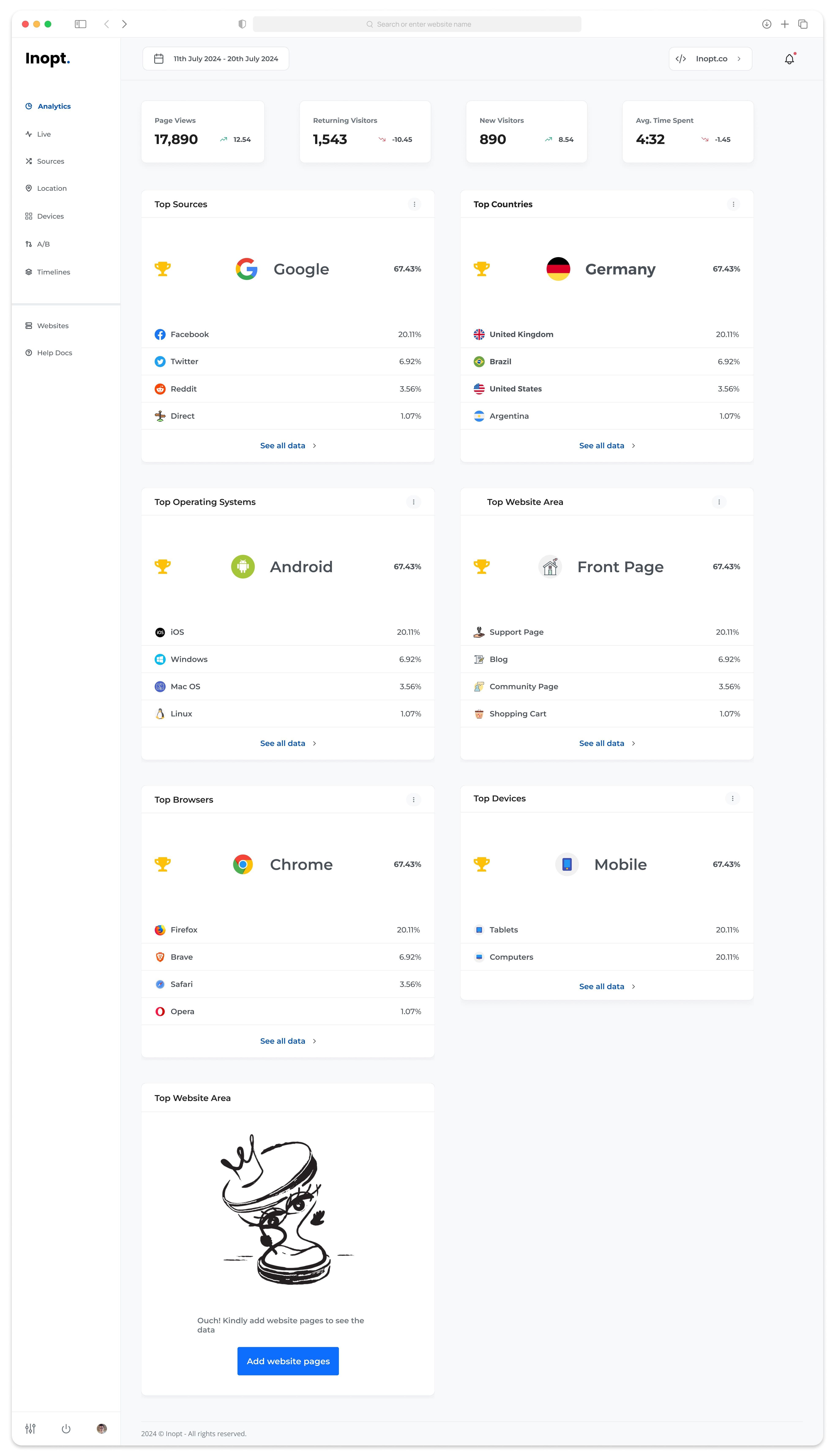
- This is the main page or Analytics page of the application. On this page, a user will be able to get a glimpse of different data and can navigate to details. In the first section, 4 cards are showing the most basic of the data from page views to average time spent on the website.
- Below this section, we have different cards showing different data like sources, devices, operating systems etc. The unique thing about these cards is the winner section. On the top of each card, I have displayed a winner for each category. This makes it easier for the user to determine the best performer for a selected time range without going into further details.
- The winner sits next to a trophy icon with a bigger size font for the name as well as percentage. Below the winner is the list of the contenders who almost made the cut.
- On the top of each card, we have a three-dot button. This button opens a sub-menu with a range of options like Export the card data in PDF or XLS format.
- Lastly, at the bottom, we have got a call to action button. The additional space on the right is kept so that we can scale the design as different features and cards are added in the future. The content is aligned to the left of the screen.
Sources Page

- On this page, I have three cards on the top with a detailed table below. The cards on the top are used to show different leaders in sub-categories. I have followed the same principle from our main page by building a typography hierarchy for the data.
- The function that differentiates the application from the competitors is an option to compare various kinds of data which can be accomplished by pressing the checkbox in front of different data points and pressing compare which is the call to action for this page.
- The users can add different sources and create new audiences by pressing Configure.
Configure Page

- This is the layout for the configure section of the application. In this layout, there is an option to create new campaigns or audiences.
- Every campaign or audience can be excluded from the results by simply using a toggle. In this layout, we also utilized the extra space on right.
Winner Analysis Page

- On this page, we show a detailed analysis. On the top is a tab bar navigation to switch between three types of analysis.
- Below that we have a responsive card layout with a clear indication of the analysis conclusion.
- A user can run this analysis on the previous screen by selecting different data and pressing our call to action button.
A/B results

- This page follows our two-section layout. The first section shows the latest comparisons and the winners.
- In the section below, I went with a table with basic details and results for each change.
Timeline Page

- For this page, the main challenge was to display visitors each step in a way that doesn’t overload the user with a lot of information and a user can quickly go through major points and distinguish things visually.
- For the first section, I went with a card layout to preset the most basic information about the timeline which most people spoke about during research.
- For the visitor’s actions, I went with a timeline structure. Each data point has different icons assigned to them to make it easy to go through while scrolling instead of reading each line. The major actions are highlighted with a card and hierarchy using different font sizes and color.
Other Pages

📊 Results
❓How might we design an application that simplifies analytics in a form that can be consumed in one glance?
✅ In the above design, we have focused on presenting the users with a winner in each category for the selected date range. In my beta testing, I found out 18 out of 20 people were able to compare the top countries that bring them the most business in less than a minute on more than 10 different metrics.
❓ What can we do to make the installation process less time consuming for users?
✅ Bringing down the installation to a simple two-step process on the dashboard itself just after registration helped increase website additions by 45% in comparison to a separate onboarding screen in my beta testing.
❓ What features we can incorporate to increase our user base?
✅ Using the research above, I was able to sort out the most used features by the users and find the frustrations behind them. For instance; users love watching exactly what their visitors did on the website but with a larger volume of traffic, it becomes difficult to go through each and every recording. In a closed group testing, I found out that timelines increased the user’s speed of finding a piece of information 4 times in comparison to a recording creating a USP for our product.
